a) Understanding and engaging with legislation
Accessibility
At Staffordshire University, we use the Blackboard VLE. Blackboard products are designed and developed in accordance with the internationally recognized Web Content Accessibility (WCAG) Guidelines 2.1 which covers a wide range of recommendations for making Web content more accessible. When creating modules, we refer to the Blackboard Accessibility Checklist:
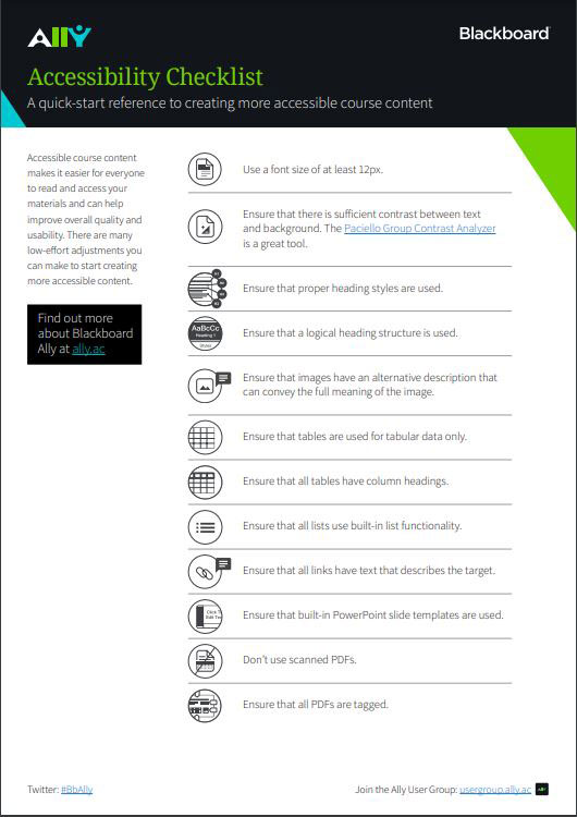
Blackboard Ally
At the top-left of the Blackboard Accessibility checklist, you will notice the Ally logo. That is Blackboard Ally, a tool that helps make course content in Blackboard accessible to all users, and it does this in the following ways:
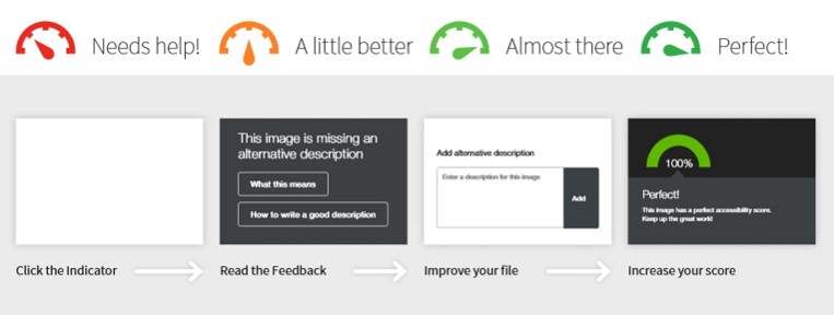
1) Ally automatically scans uploaded course content and provides colour-coded accessibility scores and feedback on how to improve the accessibility of the content.
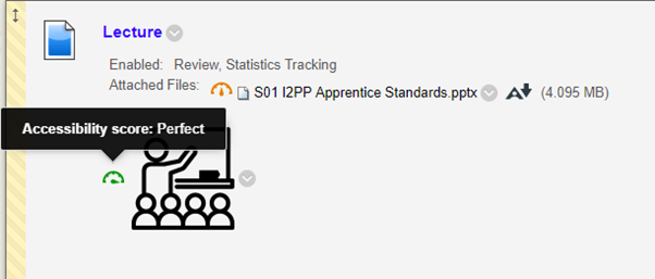
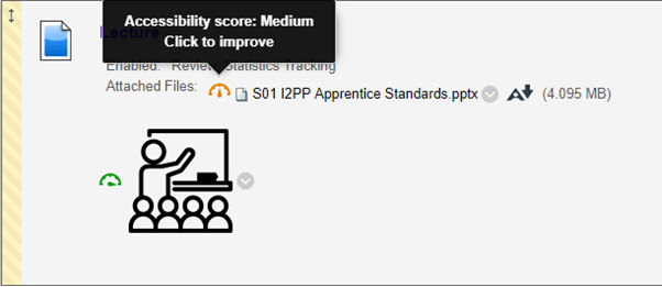
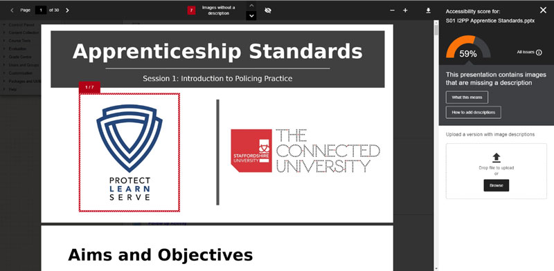
For example, in this screenshot from one of our courses, the logo has a perfect accessibility score but the attached PowerPoint has a medium accessibility score:
Clicking on Click to improve brings up the following which shows that the PowerPoint presentation contains images that are missing an alternative description (alt text). The reason why this important is that alt text is used to assist users with screen readers. Once all the images are allocated an alternative description that conveys the full meaning of the image, then the accessibility score goes up.
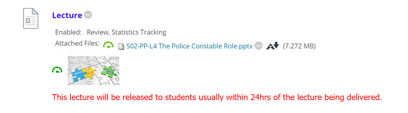
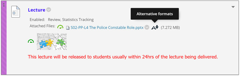
2) Ally generates alternative accessible formats for uploaded files that users can download for their personal use. In the following example, a PowerPoint has been improved so that it shows a nearly perfect accessibility score. When the user’s mouse moves over the Ally icon, it shows that alternative formats are available:
When the user clicks on Alternative formats, the following window opens up:
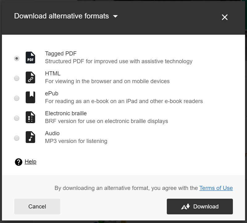
I have learnt that this is an excellent feature. I have tried this with a very long Microsoft Word document and it converted the file extremely quickly into an mp3 file. I was able to access this on my phone and listen to it while I had a walk one morning.
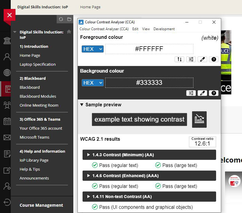
Colour Contrast Analyzer
One of the tools the Blackboard Accessibility Checklist refers to is the Paciello Group Contrast Analyzer which will tell you if there is sufficient contrast between text and the background. The following example, from my Digital Skills Induction module, shows that the contrast used in the menu is in accordance with WCAG guidelines:
Accessibility help through the library
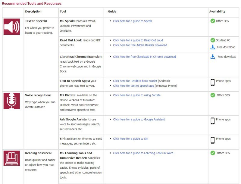
On all our modules, as well a link to the Institute of Policing Library page, there is also a Study Smarter with Technology link. This links to a University library page which lists many useful digital tools to help learners, such as Read Aloud and Dictate in Microsoft Office 365, and the Microsoft Immersive Reader.
In the following video, I compared the Read Aloud tool in Microsoft Word with my own voice. Although the artificial voice doesn’t quite match the patterns of stress and intonation in my voice, the result still shows a very good text-to-speech system. We find that our students who have dyslexia find the Read Aloud tool very useful.
Reflection
Although the word “accessibility” usually means that people with disabilities, such as hearing, visual or mobility impairments, are given the chance to learn the course material as well as all the other students, it actually benefits all users.
- Consistent navigation – not only does it make it easier for those who use screen readers, but it will make it easier for all users to navigate learning content.
- Including a transcript or closed captions on a video – not only does this help learners who are hard of hearing or deaf, but it also helps anyone else on the course who happens to be in a noisy environment or who doesn’t have headphones.
- Using a high colour contrast – not only does making viewing content easier for those with visual impairments, it also helps learners who are looking at the content in a bright environment.
I don’t consider myself to have a disability (apart from a slight problem with my eye, which I mention below) but I still find several of these accessibility tools extremely useful. For example, one tool that I like to use, especially when I’m out walking and I suddenly have a lightbulb moment, is the Dictate tool in Microsoft Office 365 and Online. I use the online version on my phone and find it extremely accurate to use, even with my slight Brummie twang. Apart from that, it is an excellent tool for people who aren’t very fast at typing.
I completely understand why contrast is important. I have a problem in my right eye caused by a scar on the retina, very close to the fovea, which distorts my vision slightly. The result of this is that there are some contrast combinations which cause my eyes to ache. I run a Facebook group and I have to decline posts from people who use coloured backgrounds because I have varying degrees of difficulty reading them. I find that these two are the worst combinations in Facebook:
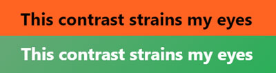
Unsurprisingly, the text with the green background fails all WCAG 2.1 results. The black text against the orange background causes me more discomfort than the green example and my eyes ache after just a few seconds if I try to read text with that colour contrast combination. However, what surprises me is that black text against orange background passes all WCAG 2.1 tests! It goes to show that just because a Web page passes colour contrast tests doesn’t mean the colour combination is acceptable.